Freelance Comprehensive Editing
An employee handbook is typically not an enjoyable read. The rules, regulations, legalities, and codes can be overwhelming. What if a new employee received a handbook that read like a Choose Your Own Adventure book? Without comprehensive editing, that handbook would lead to confusion, frustration, and even injury.
A public health nursing consultant presented a new employee handbook that was in dire need of revision. She suggested a design that was digital friendly as it would be presented in PDF form to new hires. She felt it should be straightforward, professional, and .
The handbook appeared to have been written by more than one person. The style, grammar, and syntax were inconsistent throughout the document as were the topics covered. The completed handbook now possesses a continuity that was sorely missing.
Please go through the slides on the left to view the editing process and the newly revised employee handbook.
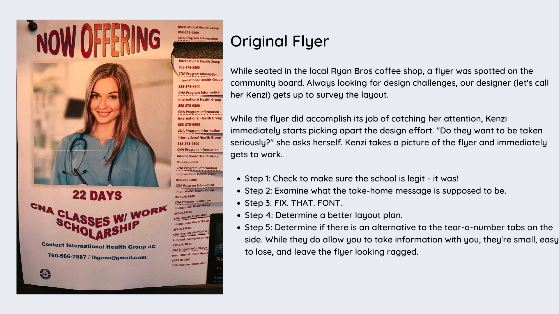
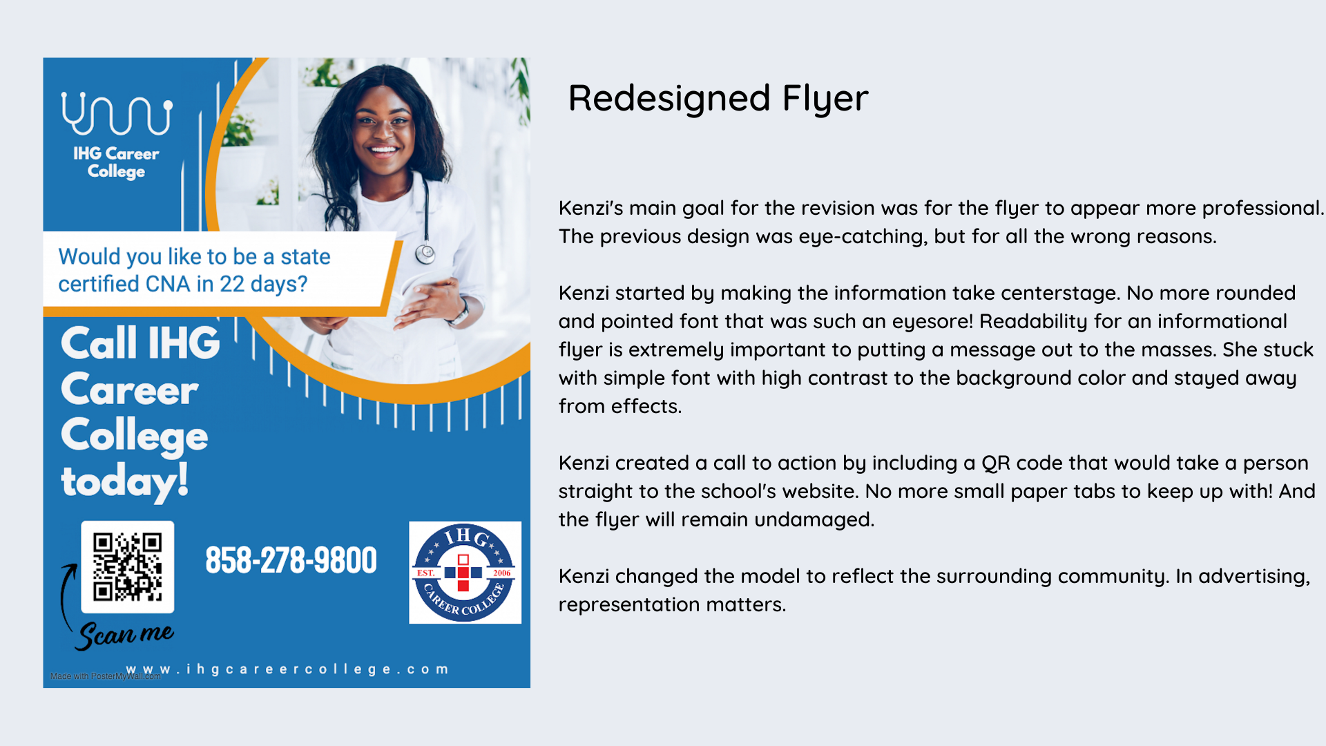
Flyer Revision
Editing is as important for visual communications as it is for written.
To the left is a flyer revision performed for a medical institute in the North County area of San Diego. Follow the thought process of designer "Kenzi" as she revamps the whole aesthetic and takes the original flyer from amateur and drab to professional and attention grabbing.
Revising previous work can be a humbling process, however, it presents an opportunity to showcase learned knowledge from new experiences.
PowerPoint presentations can result in accidental naptime for the audience member if slides are too wordy, too visually confusing, or if the presenter has the charisma of a washrag. Thankfully, there is hope! To the left is an example of lessons learned and applied to an older presentation.
Reviewing the techniques in the original presentation, it is clear that it has snooze fest potential. While not the worst, it needs polishing. Armed with the knowledge of how to better engage an audience, the presentation went from boring and chaotic to clear and concise.
Gone were the slides of too many words with charts and graphics so small, only the presenter could read them clearly. Graphics took on a larger role of storytelling and were no longer a distraction.
Learning specific style guidelines for presentations would save anyone from the embarrassment of knowing people walk away unsure of the topic discussed. Knowing less is more and that visuals and graphics can be used in an emphatic manner to deliver messages means no one will have to fight off the sleepy head nods again.
**The presentation originally contained audio. The slides only display design changes without audio.


